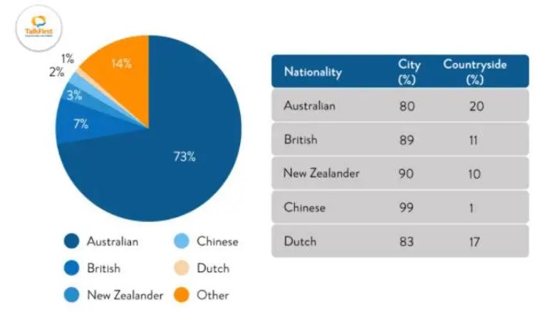
The table and pie chart illustrate populations in Australia according to different nationalities and areas. Summarize the information by selecting and reporting the main features and making comparisons where relevant.
The table and pie chart illustrate populations in Australia according to different nationalities and areas.
The given pie chart and table depict the information about the populace in Australia with respect to their country and area.
Overall, it can be clearly seen from the pie chart that out of 100% of the population of Australia, approximately three quarters are Australian, and the rest the others are from other nations. Moreover, the tabular chart shows accurately that most Chinese live in metro areas, and only a few prefer villages.
To begin with, Australia consists of the largest no. of natives in Australia, with 73%. At the same time, Britishers are only 7%. According to the data, 3% of New Zealanders reside in Australia. The counts of Chinese and Dutch are 2% and 1%, respectively. The Remaining 14% of inhabitants are from other nations.
Probing further, the ratio of Australian occupants in the city and countryside is 8:2, respectively. However, 89% of Britishers live in cities, and 11% of them live in villages. In the case of New Zealanders, 90% prefer metropolis rather than Bourg. 99% of Chinese stay in cities and the rest 1% in villages. People of Dutch in Australia live in towns and metro cities with a percentage of 83 only 17% occupy hamlets.
Follow Us Our Facebook Page For Updates related to IELTS material


Leave a Reply