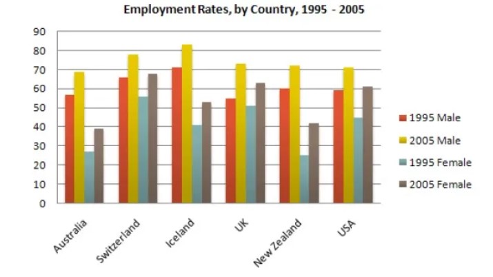
The graph above shows information about employment rates across 6 countries in 1995 and 2005. Summarize the information by choosing and describing the main idea, and make comparisons where appropriate.
The bar graph illustrates the data about the estimation of occupation in six countries, Australia, Switzerland, Iceland, the Uk, New Zealand and the USA, in 1995 and 2005.
Overall, it can be seen that the employment rate among men was higher than that of females moreover Iceland and Switzerland were comparatively better than the other four countries.
In 1995, more than 65%of males were employed in Switzerland and Iceland, and all the other countries were below 60%. The rate for men in the UK is the lowest, about 55%.comparing to females New zeeland was the lowest service rate about quarter .in contrast Switzerland was the highest rate were about 55%.
In 2005, the service rate of males in Iceland remained the highest as 1995, about one fifth allowing the other countries .where as Australia which is the lowest, below 70%. In contrast, females in Switzerland were the highest, which represented just below 70%.and the least percentage was calculated at nearly 40%when compared to the other countries.
Follow Us Our Facebook Page For Updates related to IELTS material


Leave a Reply