
 (1)")
The line graph below shows the number of annual visits to Australia by overseas residents. The table below gives information on the country of origin where the visitors came from. Write a report for a university lecturer describing the information given.
 Sample Answer of The Line Graph Below Shows the Number of Annual Visits to Australia by Overseas Residents
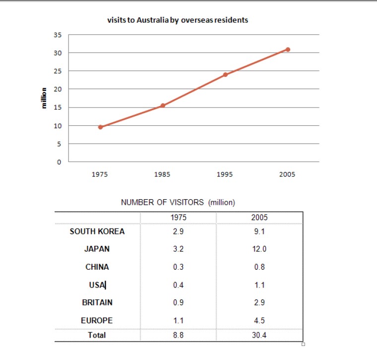
The two given guides depict foreign dwellers who yearly call to Australia and their data on the State of genesis where they came from.
From the chart, it is illustrated that in the year 1975, it recorded 8.8 million tourists that came to Australia with a breakdown in the numbers according to each country of origin showing 2.9 for South Korea, Japan with 3.2 and inclusion of the remaining nations with 2.7. However, it’s gradually increased from 8.8 to 16 million in the year 1985.
Nevertheless, it’s continued to climb having 24 million of drop over in the year 1995. At the same time, it peaked in the year 2005, receiving 30.4 million with each Kingdom having a component in the figures. In accordance to the numbers given as 9.1, 12.0, 0.8, 1.1, 2.9 and 4.5 in conjunction with South Korea, Japan, China, USA, Britain, and Europe respectively.
Overall, it is enumerated that the number of guests who came to Australia kept on rising over the years with no discrepancy among the statistics given in the birth territories.
Follow Us Our Facebook Page For Updates related to IELTS material
Also read: You Have Discovered a Lot of Rubbish in A Lake Near Where You Live
Leave a Reply