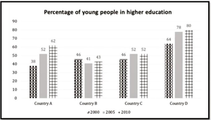
The chart below shows the percentage of young people in higher education in four different countries in 2000, 2005 and 2010. summarise the information by selecting and reporting the main features and make comparisons where relevant.
The bar chart illustrates the youngest people in higher studied in four various nations in the year 2000, 2005 and 2010. The data is celebrated in percentage.
Overall, it can be seen that country D had the highest proportion of youth enrolled in tertiary education over the decades, and in all the countries apart from country B, there was an increase in youth and enrolled over the ten years.
The most significant climb in youth enrollment in higher education would be seen in countries A and D. In 2000, about 38% of the young people from country A were enrolled in universities, while in 2010, the proportion stood at 64%. Similarly, country D rose in the proportion of young people studying in higher education with figures rose from 64% in 2002 to 80% in 2010.
In-country C, there was a marginal surge, and the proportion of youngsters studying in universities went up by 46% to reach 52% over the decade. Unlike countries A, C and D were fluctuations in the percentage of youth in higher education programs in country B. The figure fell from 46% to 41% 2005 then Rose slightly to stand at 43% in 2010.
Follow Us Our Facebook Page For Updates related to IELTS material
Also Read Underground Station Passenger Numbers in London


Leave a Reply