
 (1)")
The graph below shows the information about cases regarding covid-19. Summarise the information by selecting and reporting the main features, and make comparisons where relevant.
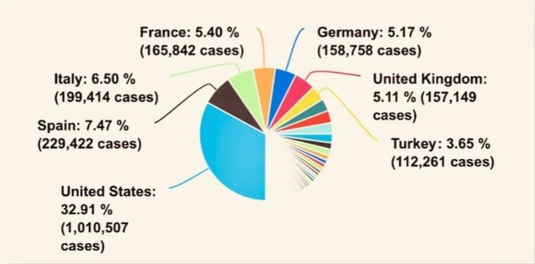
The pie chart illustrates the statistics of covid-19 cases in seven different countries, namely; United States, Spain, Italy, France, Germany, United Kingdom, and Turkey. Overall, the United States recorded the highest number of cases while Turkey has the least.
It is observed that the United States reported 1,010,507 cases with a percentage of 32.9%, which is the greatest number of cases in comparison with other countries. This indicates that a greater number of the population are exposed to the covid-19 virus. Also, Spain and Italy are slightly close in the number of cases reported with a total of 229,422 and 199,414 cases respectively and percentages of 7.47% and 6.50% respectively.
It is also noted that France, Germany, and United Kingdom have a closer percentage of reported cases which is about 5%, with 165,842, 158,758, and 157,149 cases, respectively. Meanwhile, Turkey has the smallest number of cases occupying only 3.65% and 112,261 cases in total. This may likely demonstrate that measures of containment of covid-19 the virus are more effective in the country.
Follow Us Our Facebook Page For Updates related to IELTS material
Also Read Someone Returned to You a Bag that You Lost
Leave a Reply