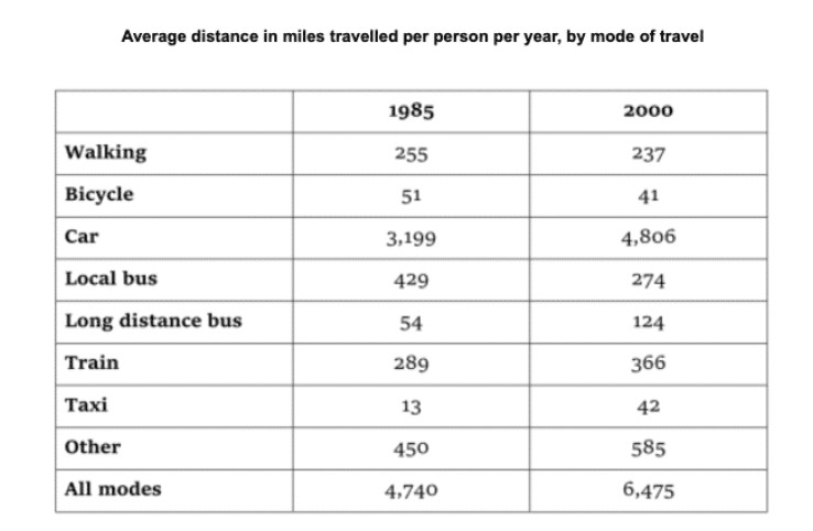
The table below gives information about changes in modes of travel in England between 1985 and 2000. Summarise the information by selecting and reporting the main features, and make comparisons where relevant.
The Above spreadsheet characterizes the changes in conveyance in the average distance in miles travelled per person between 1985 and 2000.
Overall, the most outstanding feature is that people who choose to travel by car was the highest in both years at the end of the period whilst humans who pick out travelling by local bus remained the second highest. The significant features will be discussed in the following paragraphs.
As is presented in the tabular graph, people who select a personal drive mode to reach their destination hit a peak of approximately at 4 806 in 2000 and fall drastically to 3, 199 in 1985. Those whose other unknown means of transportation declined at the beginning of the period and increased suddenly to 585 at the end of the period. By contrast, those who choose the local transportation means surged to 429 and went down by average respectively.
Moving further, those who commute by train to their various destinations declined at 289 and rose significantly to 366 over the period of time. In Converse, those who decide on walk mode surged to 255 at the beginning of the period and later dropped by 18 respectively whilst those who go for Bicycle, Long distance bus and Taxi were the lowest distances in miles.
Follow Us Our Facebook Page For Updates related to IELTS material


Leave a Reply