The chart below shows the amount of money per week spent on fast food in Britain. The graph shows the trends in the consumption of fast foods. Write a report for a university lecturer describing the information shown below.
The chart below shows the amount of money per week spent on fast food in Britain. The graph shows the trends in the consumption of fast foods. Write a report for a university lecturer describing the information shown below.
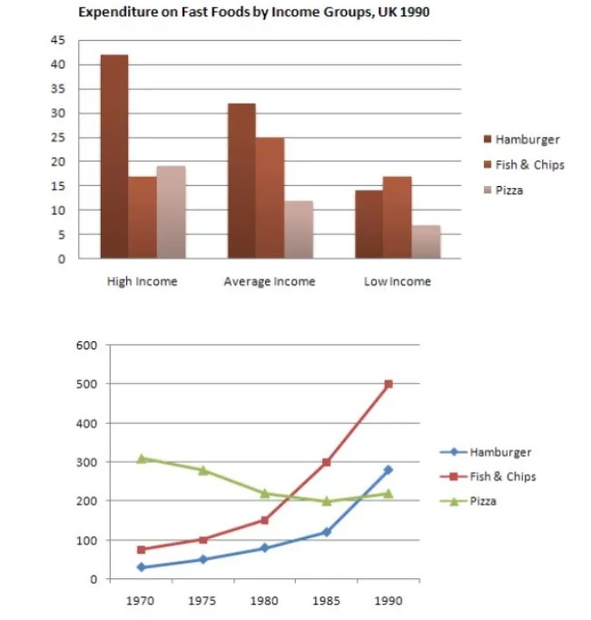
The given bar charts illustrate how much money was spent on three fast-food types per week in Britain while line charts reveal consumption of fast foods from 1970to 1990. Overall, it can be seen that the majority of money spent on fast foods was on hamburgers by all three groups while usage of fish and chips and hamburger went on an upward trend while pizza on the downward.
For hamburgers, 40 money was spent by the high-income group, which was the highest, followed by 30 on average income. Low income spent was half than it was by average income group. For fish &chips, low and high-income spending was identically same on account of 16 while it was 25 by average income group. For pizza, only five amount of money spends by low income, which was half what it was by the average income group. The high-income group had 17 amounts of spending.
In 1970, pizza usage was on the peak at 300, which declined later whereas fish & chips and hamburger had below 90 which grew later. After a decade, pizza and fish&chips were the same usages, 200. Afterwards, the former consumption did not change and ended at 200 in 1990. The latter one shot up steadily and touched its zenith in 1990 with maximum500. Over two decades, hamburger consumption was parallel to fish and chips, from 30 to 300.
Follow Us Our Facebook Page For Updates related to IELTS material


Leave a Reply