
 (1)")
The chart below shows the proportions of the world’s oil resources held in different areas, together with the proportions consumed annually in the same areas. Summarise the information by selecting and reporting the main features, and make comparisons where relevant.
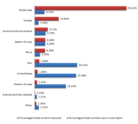
The chart below shows the proportions of the world’s oil resources held in different areas, together with the proportions consumed annually in the same areas. Summarise the information by selecting and reporting the main features, and make comparisons where relevant.
The bar chart below shows the amount of the world’s oil assets runs in different areas and with the amount consumed annually in the same areas.
The data are given in the form of a percentage. It is clear that in resources, the middle east is highest and Australia and New Zealand are lowest. And in consumption Aisa is top on the table and again Australia and New Zealand are lowest.
The middle east is top of the table in the resources with 56.52% and uses 6.15% of them. In addition to it, Canada has four times lower produce in oil compared to the middle east with 14.84% and three times lower in uses of oil with having only 2.48%. In eastern Europe the amount of both are almost equally having an only difference of 0.2%, are 6.58% and 6.56%. Asia consumes 13 times more than it produces, uses 26.21% and produce 2.89%.
The United States follow the same trend as Asia, using 25.48% and generating 1.85%. Australia and New Zealand are the lowest in both producing less and using less. They produce 0.30% and uses 1.31% of the whole. Meanwhile other are also same in trend as Australia and New Zealand.
Follow Us Our Facebook Page For Updates related to IELTS material
Leave a Reply