
 (1)")
The chart below shows the percentage of young people in higher education in four different countries in 2000, 2005 and 2010. Summarise the information by selecting and reporting the main features and making comparisons where relevant.
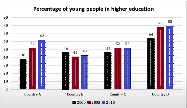
The bar chart illustrates the proportion of youth people in higher education in four different countries between 2000 and 2010.
Overall, it is apparent that country D had the highest percentage of the youth people admitted to the education over the ten years. As well as country B had the least proportion of the number of enrolled youth.
An in-depth analysis of the bar graph reveals that, in 2000, country A enrolled in 38% youth people at the same time country B and Country c had witnessed the same proportion. Meanwhile, country D stood at 64% of youth people. In 2005, education could be seen in country Aand C (52%). comparatively country B(42%), substantial rose in the per cent of the youngsters, whereas, the number of proportion of country D gradually increasing the same year. This time country D’s proportion apparently doubled with country B.
Furthermore, in 2004, there was a marginal rose witnessed by country A. then the country could have increased the number of proportions year by year. Country B seemed fluctuations in the decades, and 43%, students were enrolled in the same years. Country C stood at constantly, but in country D, the number of youth peaked at the top and showed the rising of figures to 80%.
Follow Us Our Facebook Page For Updates related to IELTS material
Also, Read Some Believe That People Will Buy a Product Based on Their Needs
Leave a Reply