

The graphs below provide information on global population figures and figures for urban populations in different world regions. Summarise the information by selecting and reporting the main features, and make comparisons where relevant.
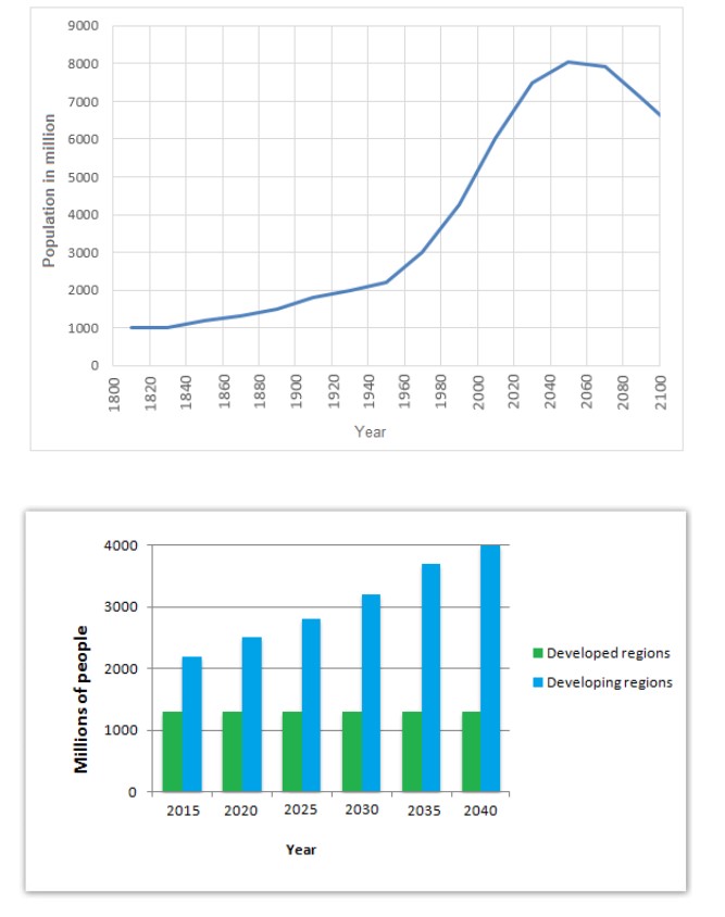
The graph illustrates the rates of the population globally from 1800 to 2100, while the accompanying bar chart describes values for metropolitan populations in two distinct regional places in the world from 2015 to 2040.
Overall, the highest population in the world ever was recorded within the years 2040 to 2080, whereas developing countries are expected to have an increasing trend of populations in the coming years.
Commence, the world’s population in early 1800 stood at around 1000 million. However, this figure rose steadily, reaching slightly above 2000 million around the 1940s. Then, the world’s population saw a dramatic increase to a peak of 8000 million before plummeting slightly, hitting the ablow point of approximately 6500 in 2100.
Regarding the bar chart, developed regions accounted for around 1200 million people in 2015 compared to a massive figure of about 2000 for the developing regions in that same year. Following this period, the number of individuals in developed countries showed relatively stable figures to just under 1500 million people. In contrast, individuals in the developing locations experienced a dramatic increasing trend in populations throughout the entire period given, reaching around 3200 million in 2030, nearly 4000 million in 2035 and finally exactly 4000 million in 2040.
Follow Us Our Facebook Page For Updates related to IELTS material
Leave a Reply